How I Built a Simple Budgeting App
Simple Bank is shutting down and their apps will stop working on May 8, 2021. Follow me over the next 40 days to see if I can build something to replace Simple's budgeting tools before they disappear. Join to get posts delivered to your inbox or follow me on social media.
Read All Of The Posts
- Building a Simple Budgeting Tool As Good As Simple's
- How Do Banks Connect To My Bank Account?
- A Sneak Peak At My Simple Budgeting App
- How I Built a Simple Budgeting App
Did I Meet My Original Goals?
Yes, it did. And in time before Simple closes its doors for good.
I'm going to wrap up this experiment by showing the specific ways my budgeting app both mirrors and improved upon Simple's app.
This experiment worked well enough that I'm planning to offer this to FIers users. Stay tuned and drop me a note if you'd like early access.
Filter Expenses Not Assigned To An Envelope
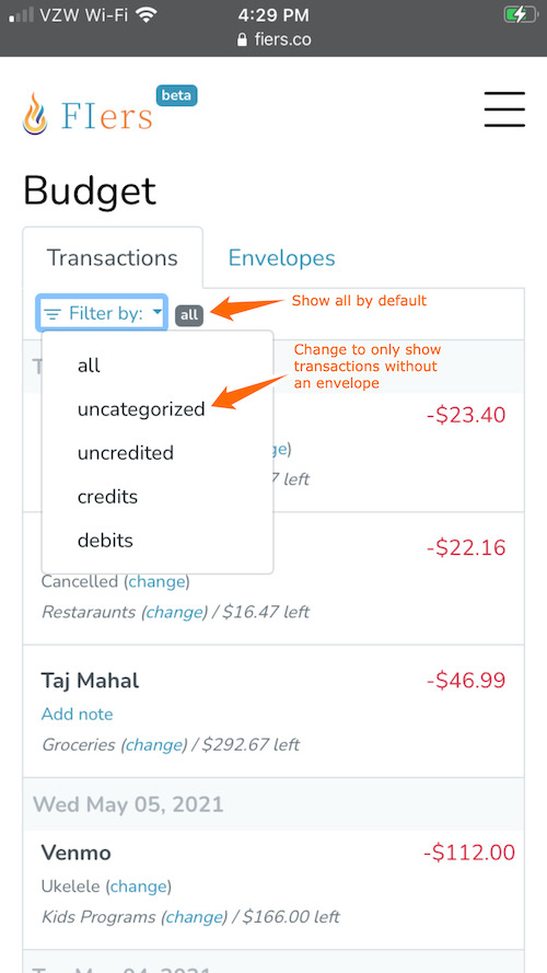
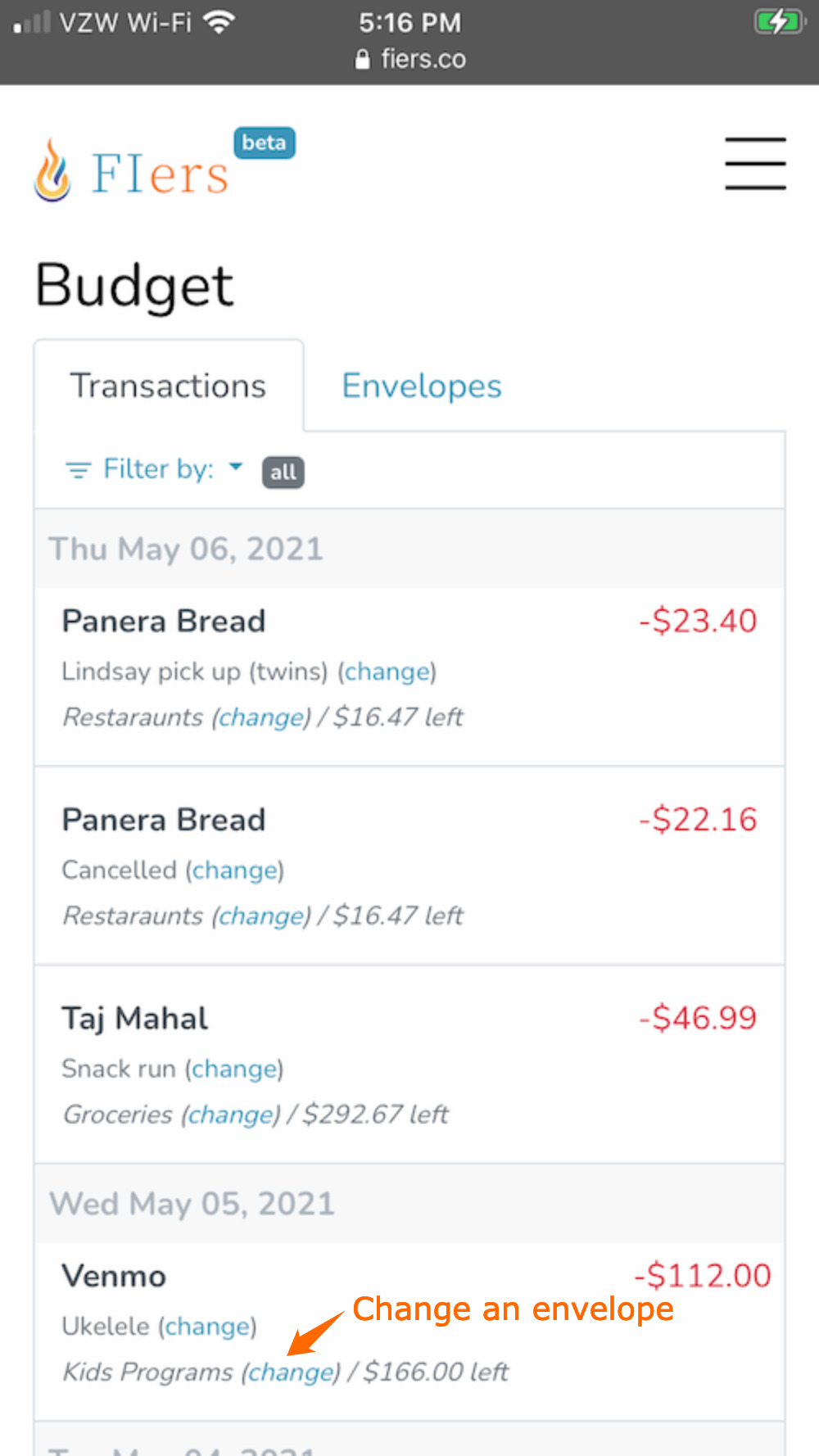
Zero-based budgeting requires that all that's spent to come from a one of your envelopes. I often found myself scrolling Simple's app looking for transactions which were not yet assigned to an envelope (or expense, in Simple's terms). I added a simple filter menu on the transactions list to only show transactions that were not assigned an envelope.
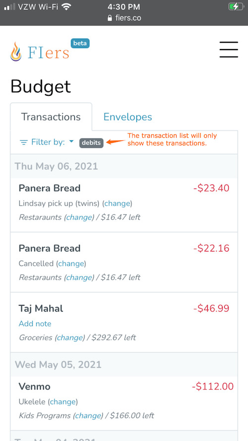
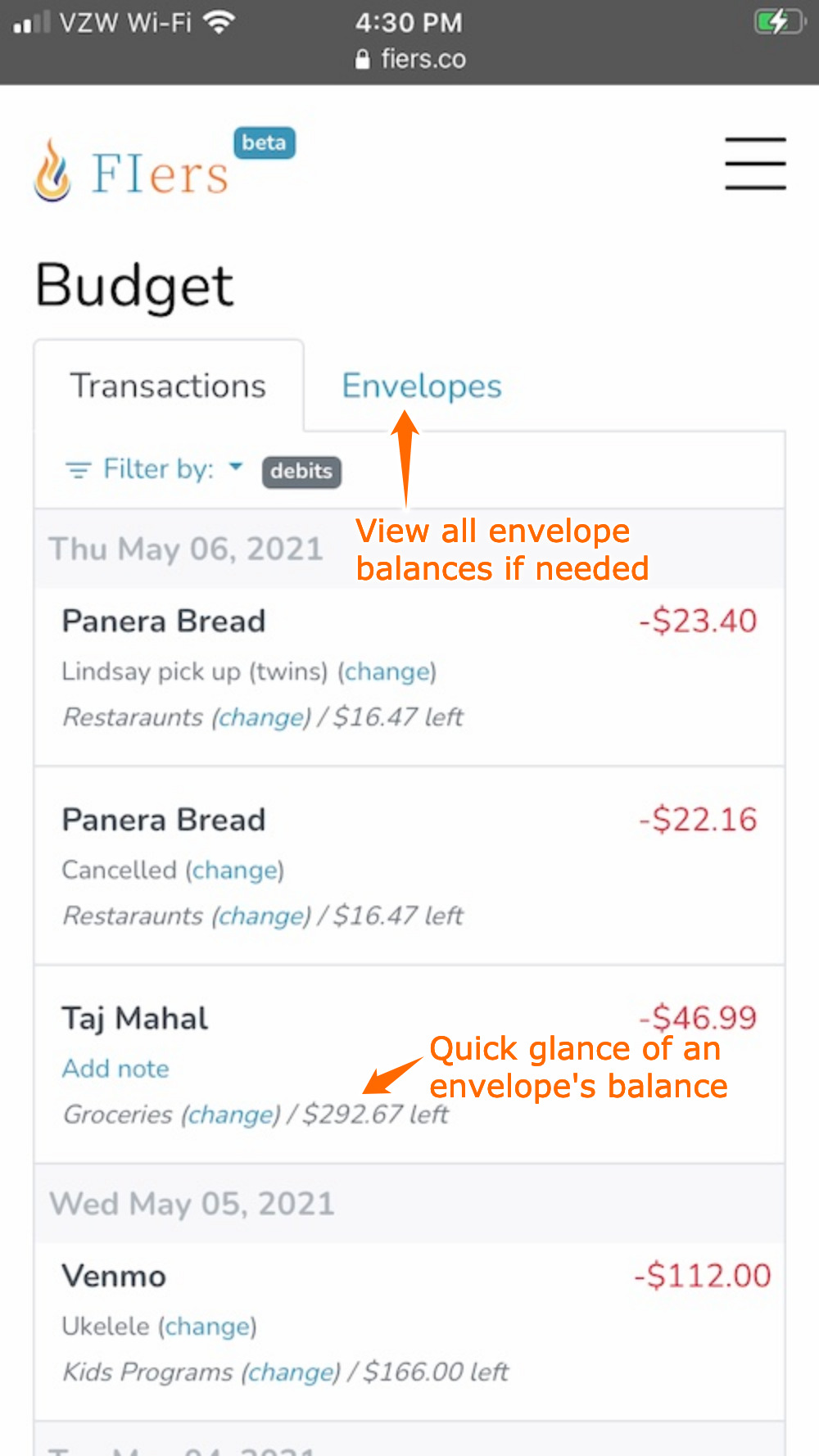
The feature works so well that I don't have any uncategorized transactions :). I'm including a screenshot of filtering by debits instead.
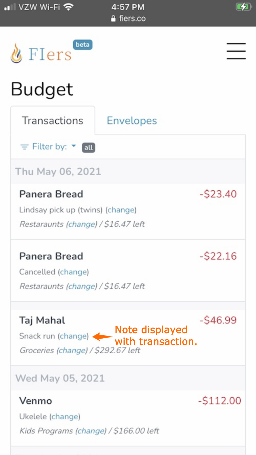
Easily Add Notes To Transactions
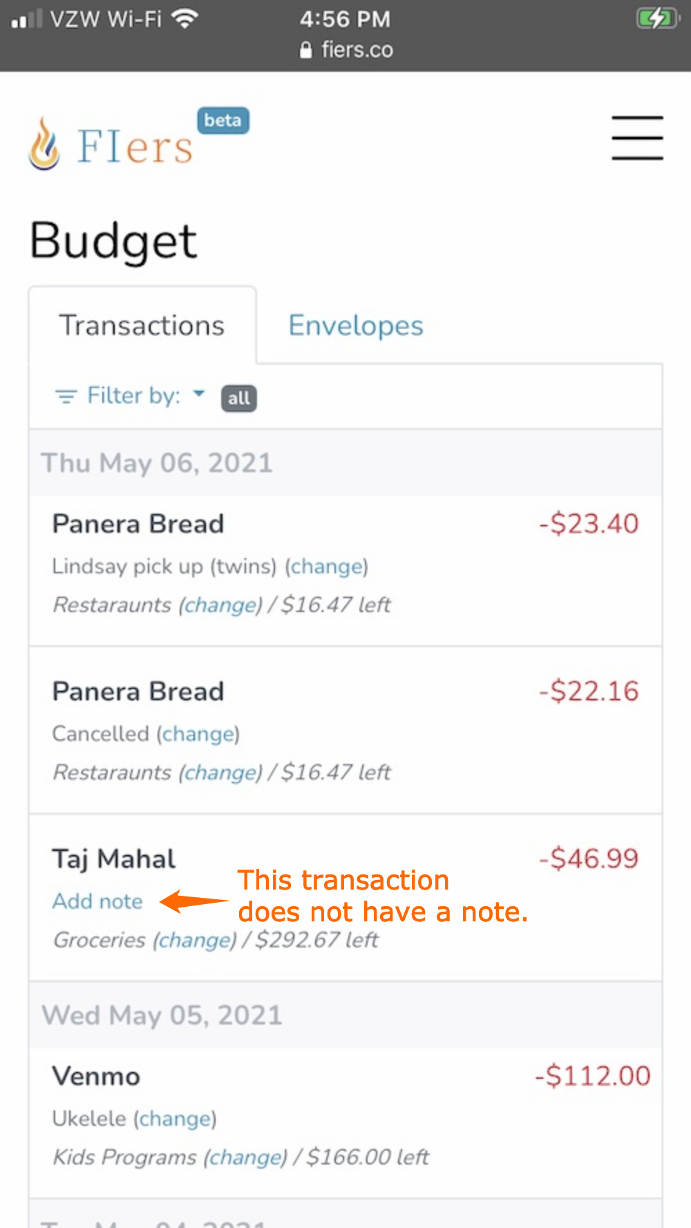
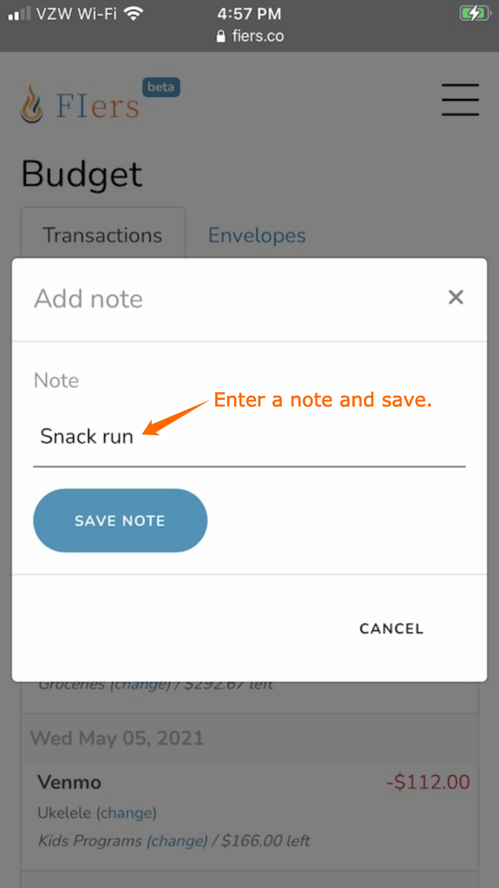
The name of the merchant is always enough information for our budgeting needs. Sometimes my wife makes a purchase or we have multiple purchases from the same merchant (cough, Amazon). Notes add a lot of information to the transation list and prevent me from having to later remember what the $34,78 purchase from Amazon was for.
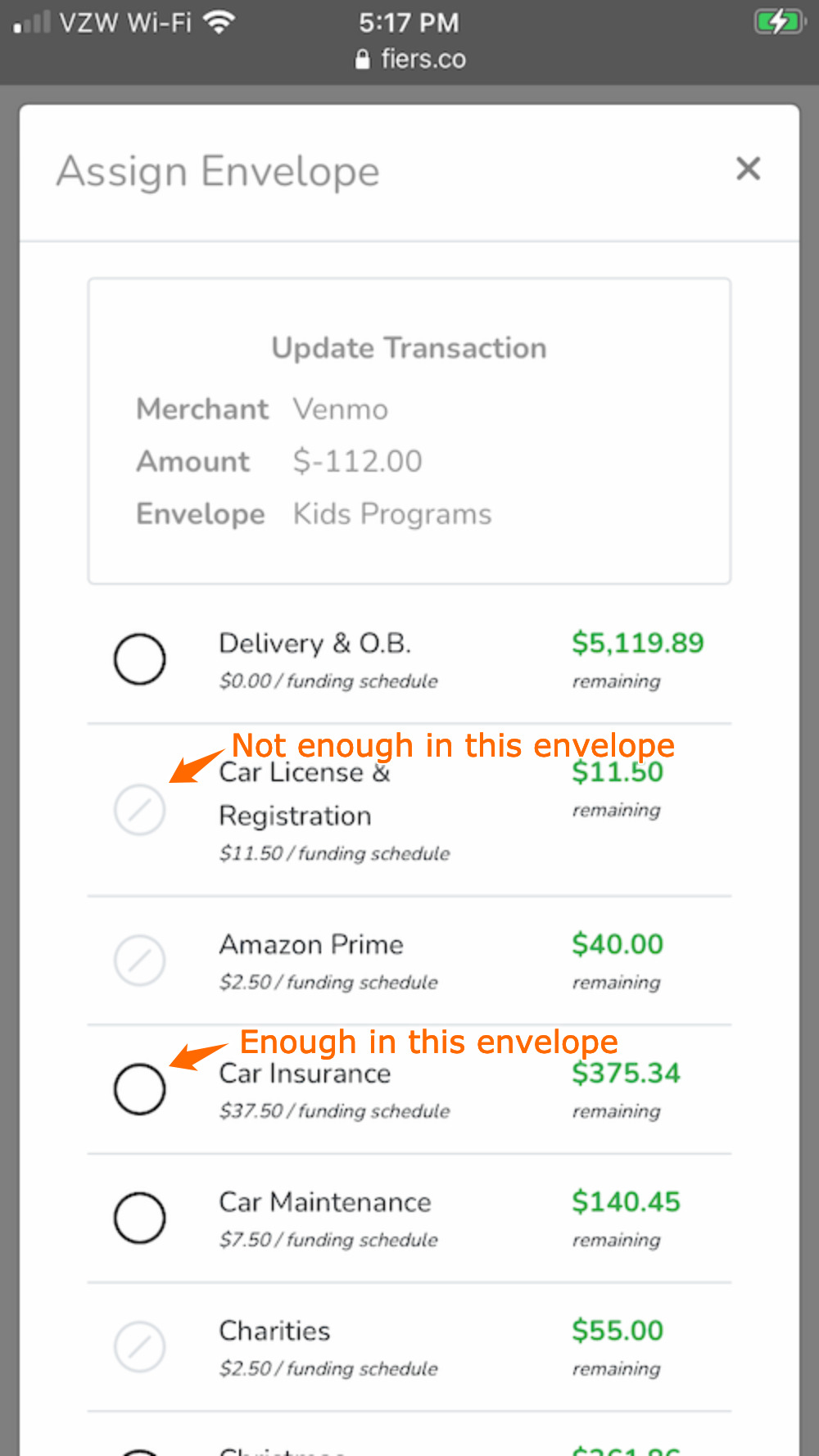
Show Which Envelopes Have Sufficient Money
Sometimes there's not enough money in an envelope to cover a transaction. I wanted to streamline this when assigning an envelope. I decided to indicate which envelopes could be assigned to the current transaction. This prevents me from choosing an envelope without enough money, only to find out after I tried to assign it. It's a subtle improvement but helps a lot.
Show Envelope Balance In Transaction List
A common task I do is checking how much money is left in frequently used envelopes. I thought it would be nice to see an envelope's balance when viewing the transactions. This is a time saver because I spend 75% of my time looking at transactions and do not have to look at my envelopes as frequently.
What's The Final Score?
I listed 7 goals I wanted to accomplish in my original post. Let's see where we are.
| Goal | Score | |
|---|---|---|
| 1. | I'm not building a bank. This will have to be used as a layer on top of a traditional checking account. | |
| 2. | I do not want to enter transactions manually. | |
| 3. | I like the envelope system and want to have tools that resemble real life envelopes stuffed with cash as much as possible. | |
| 4. | We need something akin to sinking funds that let us accrue money for bi-annual bills like car insurance. | |
| 5. | My wife and I need to be able to access the tools from our phones. | |
| 6. | We do not, nor do we plan to, set up a budget for each month. Our budget doesn't change often and we are lazy. | |
| 7. | It needs to be good enough that my wife uses it. This rules out things like Excel. |
Highlights (What Worked Well)
Filtering transactions without an envelope - This is probably my best liked feature. I can quickly and confidently see which, if any, transactions need to be assigned to an envelope.
Automatically Downloaded Transactions - I will schedule transactions to download once a day. It's not real time but should be good enough and I do not have to enter them manually.
Envelopes - Assigning transactions to envelopes is really easy and fast. It actually takes one less tap to do than it did with Simple's app. I'm also displaying the remaining balance for a transaction's envelope right with the transaction itself. This is another optimization I was able to make that the Simple app didn't.
Mobile Ready - It works a lot better and is faster on my phone than I expected. I did have to make a few changes to how envelopes were assigned but they worked well and exceeded my expectations.
Speed - This opens extremely fast on my phone. Faster than my bank app. I also do not need to require Touch ID or a passcode since it only lists my transactions and does not communicate directly with my bank at all.
